Blog
- Details
- Ashley Hanson
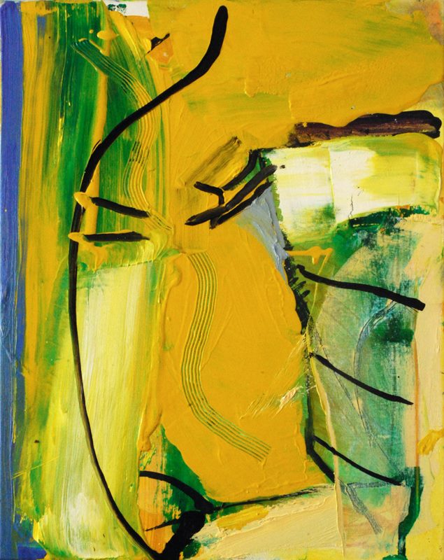 'Cool Yellow Harbour' 50x40cms
Made during last weeks course in Port Isaac. It's Port Isaac but of course it's Porthleven too...Cool yellows - Lemon, Primrose, Indian Yellow mixes against a just-purple stripe. The conscious/unconscious looping black line, pure and free, securing space. The wedge of grey, critical and holding its own amongst the gang of yellows....The final refinements the two small yellow brushmarks, below the black-line bottom-centre and up the right-side, creating another movement...
The painting began with a demonstration of why the knee-jerk blue sky against green hillside is rarely the most exciting palette in a landscape...
And now it's here: an operation around my eye tomorrow. I needed to do this painting.
- Details
- Ashley Hanson

A new painting made on the recent Porthleven course. Chance plays a part in all painting; after a drawing session around the harbour, we began the first painting with a lottery, resulting in each artist having a different colour to work with. My 'selected' colour was BROWN which you don't see often in my work. I had to borrow some Umbers and Sienna's from one of the other artists. It was a colour challenge but I'd used brown before with Stillman's overcoat in the 'City of Glass' series, so I knew I would be reaching for the blues and pinks.
Waves barrelling in, threatening, submerging the oval harbour-shape that is there but not there, a fragile line. Anti-clockwise circular movement, the different thing the pure pink curve in the foreground - hovering -and the Auerbachesque chevron that defines the top of the painting and brings the eye downwards...
 'City of Glass 15 - (Stillman walks...)'
 day 2
day 2
- Details
- Ashley Hanson

'The Riddle of the Sands' 40x280cms Penny Watts
There was a fascinating and varied response to the novel from the artists on the recent 2-day Freedom in Painting workshop at Creek Creative, Faversham. Narrative, incident, characters, location, timelines, were all explored alongside colours and emotions sourced in the text. The theme of the novel was particularly challenging with nothing physical and 'real' to respond to but words provoke image and stir the imagination and the painters' skill makes those images and ideas visual and concrete.
We did not have a set novel. The choice was down to the artists, who were asked, in advance of the workshop, to read and re-read their chosen work and find the essence and bring ideas and studies to the workshop to transform into painting. Some of chosen novels (or poems) were recently read but most were long-term favourites connecting to the artists' personal journeys and interests. The chosen works were:
'The Riddle of the Sands', 'The English Patient', 'Housekeeping', 'Moby Dick', 'On Chesil Beach', Journey into Nature', 'The Day before Happiness', 'A Sleepwalk on the Severn', 'Wide Sargasso Sea', Remarkable Creatures' & 'Swallowing Mercury'. Many of the novels contained dark themes which came across strongly in the paintings.
The wording of the title of the workshop - 'BOOK - Painting the Novel' was deliberately ambiguous, allowing room for the artists to include the physical presence of their book in their painting(s).

The relationship between books/text/words and painting is long and distinguished, from illustrations of the Bible and Greco-Roman mythology to Anselm Keifer's responses to the Kabbalah and Paul Celan's heart-wrenching poem 'Death Fugue' in the Margeurite and Shulamith paintings. However, during my research I was surprised to find how rare the novel is/was as a subject for serious painting.
As always, the workshop began with an introductory talk, referencing paintings inspired by 'Don Quixote', Edgar Allen Poe, Kafka, Lewis Caroll, Grimms Fairy Tales, 'Lord of the Flies', Albert Camus and inevitably 'The New York Trilogy'. We also looked at illustration and at the magical trinity of calligraphy, poetry and painting in Chinese art. Ideas and methods were discussed and exchanged before the artists began their personal translation of those ideas into painting. An almost impossible task in 2 days but this commited & hard-working group of artists certainly delivered.
GALLERY

ARTIST'S COMMENTS
'Very exciting and challenging workshop.Loved the lecture with photographs at the start' GRISELDA MUSSETTS
'The workshop brought the painter in me awake...it opened the soul - made liquid the heart' KATHLEEN ALBERTER
'I learned a great deal and now feel I am beginning to understand abstract painting. Ashley is a very inspirational teacher and always has a way forward out of a difficult situation' ANITA BONE
'The workshop opened me up to trying something I haven't done before - very exciting.' TEDDY KEMPSTER
- Details
- Ashley Hanson

NOV/DEC 2020
With the conclusion of the '20 Books=20 Paintings' series and the exhibition at Linden Hall Studio, getting closer, I've been looking again at all the paintings. With this piece I strengthened the line and colour around the canvas. The area of blue on the right is now denser and flatter, cradling the head of the bull. A powerful painting.
 'Book 3' 45x70cms oil on canvas
12 JUNE
More paint...redrawing... more paint...redrawing...the eye removed, a twist of the head, strength now in the legs,,, now we see the weight and power and menace of the beast. Now more Picasso than Chagall (below)... what do you see? where are we? what book?


9 JUNE 2018
Progress

An eye infection stops this painting moving forward but in this blurry world my vision for the painting is getting clearer...see/sea
SAT 3 MARCH
The first session - a big old storm....
- Details
- Ashley Hanson

Scarlet against grey was always intended and is fundamental to the novel. Colour as sensation and symbolic. Intense concentration with the pouring and shaping of a mark that must not be still, that must 'appear' flowing and liquid. Risk: the mark is controllable only to a certain degree, by the liquidity of the paint-mix, the position of the body and canvas and the action, but the results are unpredictable. It is exhilarating to make a mark that can never be made again. We are now getting close to that tension between the subject-matter and the physicality of the paint that underpins the best of my work.
It's a beautiful shape, curves like petals...I have found my 'unexpected'.

With the intensity of red and its' fading out, and with the circle and symbol, my intention is for the viewer to read the painting from right to left - I hope I have succeeded. Only minor changes today : a sharpening of the rectangle and a new clarity and zip in the top right corner and a touch of soft pink around the canvas. We might be done.
What a job the tilted red rectangle does. It is a specific shape/location from the novel, but it's the instinctive placement, colour, scale, purity and difference that makes it work for the painting, A counter-movement with the circle and the lilac-shape that cuts across the red.

'Book 1' & 'Book 2' together. Exciting...onto 'Book 3' - a new novel and a new continent...I'm thinking blue...
 detail (clue)

Tues p.m.
 Sun p.m.
Enjoyed painting the curve and finding the colour- Phthalo Green and Rose Madder. The twisting-curve sits well on the canvas and brings spatial complexity and movement. The painting moves forward....I have to wait a few days for the paint to settle and be touch-dry before the next moves. I'll start 'Book 3' while I wait.
 Sat p.m.
Establishing the grey (significant) shape (significant).

All I can say is that we are on a different continent to 'Book 1'...
PROCESS:
Read, select, brush, scrub, knife, pour, tilt, skim, cut, smear, photograph, Photoshop, write, pour (glass of wine), reflect, back to the novel...