Blog
- Details
- Ashley Hanson

'City of Glass 34 - (Watch that man...) 120x100cms
THURS 21 JAN
I have redrawn the left-side of face again & also added a very subtle line of the chin. There is a definite twist to the face now, less flat. I am enjoying the composition - how the West Side follows the angle of the face and how the bulge of Chelsea is echoed by the left ear. Two more City of Glass paintings on the go now, one I started a while ago, the other with the working title 'Village Green'. Watch this space.
SAT 16 JAN
A few subtle changes to the Bowie outline- it now seems more varied, more interesting and truer to the image. I also added a couple of small piers on the West Side to disrupt the verticals. Listening to Young Americans. The intersection of 5th Ave and 14th St is very powerful, an unintended piece of symbolism. This painting is right on the edge.
FRI 15 JAN
A tribute to David Bowie, a hero...the iconic outline of Aladdin Sane becomes the framing rivers of Manhattan. The outline is not quite right, it's a little crude,a little obvious. I may re-draw tomorrow.Or not.
Choosing the title for the piece was very difficult but critical- some were obvious, others more subtle: 'Hero', 'Starman', '285 Lafayette St', '(1913-1938-197?)', 'Millions weep a fountain..'.
I've gone for 'Watch that man...' with it's dual reference: we were all watching Bowie, wondering what he would do next.
The novel 'City of Glass'* is all about watching that man...
'Watch That Man' is, of course, the opening track of Aladdin Sane..
Emotion, image, place, ambiguity..no-one was more ambiguous than David Bowie. 'Ambiguous' comes a close second as a title...


285 Lafayette St


* from 'The New York Trilogy' by Paul Auster
- Details
- Ashley Hanson
Red is passion, courage, revolution, luck, blood, sin, fire.....
It is scarlet, cadmium, crimson, pink, burgundy, red earth.....
Red gets noticed....
A very challenging and enjoyable two-day workshop at Canterbury Christchurch University. Red means something different for each of us- I'll let the paintings speak for themselves....
 Estelle Jourd

Antonia Glynne-Jones

Philippa Langton

Heather Rachel Johnston

Nicola Waters

Robin Thompson

Aiden Flood

David Carnegie

Jo Rollnick

Mitzi Delnevo

Catriona Campbell

Jo Dunlop

Heather Rachel Johnston

Jo Rollnick

In the Studio

Colour studies

In the Studio
There was another artist, Kathleen Alberter but unfortunately we don't have an image of her striking painting. Watch this space.
Here are a few comments from the artists about the Workshop:
'Really thought-provoking' David Carnegie
'Well prepared. Very positive and helpful guidance' Robin Thompson
'The individual comments on my work were really useful and insightful...Ashley's passion for art was unflagging and fed through to everyone' Aiden Flood
- Details
- Ashley Hanson

'Sunset Ltd' 120x120cms
The third and fourth paintings in the Amtrak series, showing the journeys from Los Angeles to New Orleans and then back to New York.
As well as referencing my travels, 'Sunset Ltd' was also driven by the challenge of making a circle work in the centre of a square. Before this piece I had had a rare commission where part of the brief was to place a sun in the centre of the painting. I struggled with this and moved the sun slightly towards the bottom edge, breaking the perfection.
in a way,I felt I had avoided the challenge so I made an identical 120cms square canvas and screwed down in the centre a circular piece of wood that had been hanging around in the studio for years. The idea didn't come until a few weeks later when i read 'Sunset Ltd' by James Lee Burke where New Orleans and the train-line feature.
The expressive brushwork of the oceans spins around the still centre, flamboyant shapes continue the movement across Canada. Desert colours, the Great Lakes like palm trees. Within the plateau of the circle is the image of a sun setting behind a mesa, which also reads as the Texas Panhandle....map-truth and painting truth, plan-view and frontal view, once again intertwine.

'Crescent' below shows the last leg of my journey from New Orleans to New York. It is a strange piece, sweet colours, the pale-blue hints of sky and I see the image of a horse.

- Details
- Ashley Hanson

'Self-Portrait' 70x45cms oil on wood
My daughter Faye is working on a self-portrait in the style of Matisse for her art homework and it made me think of this painting, a rare self portrait. An antidote perhaps to all those recent red paintings. Strange, I cannot remember when or where it was made but possibly early nineties, Camberwell or Nunhead. I would have been looking at Auerbach and I was definitely looking at the Bellini's 'Portrait of Doge Leonardo Loredan' in the National Gallery.

The painting reminds me of the advantage of painting on wood - I must have been broke- where you load on the paint without picking up an impression of the stretcher bars. Though wood does weigh ten times as much!
I'm enjoying the richness of the brushwork and mark-making, the paint itself, and it's a pretty good likeness with the blue background representing the sea and it's importance in my life and my art.


- Details
- Ashley Hanson
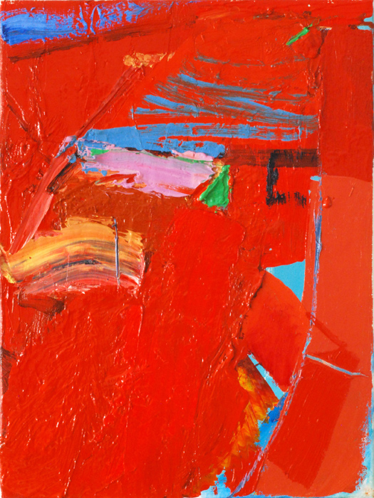
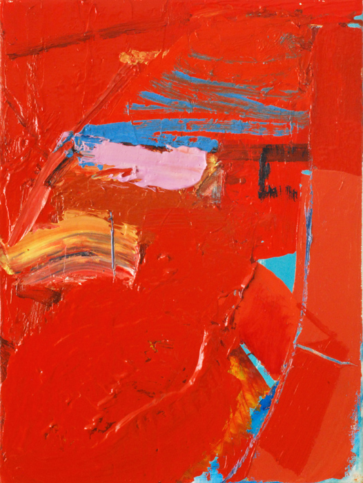
'Porthleven 24' 40x30cms
Thurs 19 November
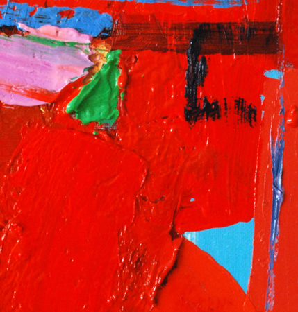
Twist! I dreamt about the painting, convinced there was something stronger to be found, making changes in my head. No hesitation this morning in the studio, straight in with the green triangle on the pink smear/pier. If you know Porthleven, the triangle is there, a piece of reality, a vertical triangle that creates a delicious dialogue with the horizontal plane of blue triangle. The green triangle is echoed by the green angled line of the slipway in the top left. Together, they imply a corner to corner diagonal movement across the painting. The large angled slab of hotter red cuts through the gap, linking to the procession of red rectangles up the right-side.
The final act, in the top left corner- a backhand slash with a loaded brush of cobalt/kings blue.
I have answered some of questions, niggles from yesterday. The painting has moved on, it's a stronger piece, more complex, more context. Denise knew it wasn't finished! No explicit image but a place defined by a unique combination/concentration of angles and curves, structure and movement. Time to move on.
Wed 18 November
A looser painting- is it enough? Could be a couple of lines away.....
Stick or twist? At any point in a painting there are a million options: choice- the next action- is dictated by knowledge, experience, intuition, emotion, curiosity, the idea, the subject. To 'stick' can be cowardice or exhaustion, the feeling of being painted out or it can be the bravest option. One hopes that to 'twist' is a sincere belief that there is a stronger painting to be found but can also be impatience or boredom, a failure to look, to see, to fully understand the piece.
It's the timeless conflict between freedom and control.
'If there is too much order, it is dead; if there is too much chaos, it doesn't cohere. I'm continually negotiating between these two extremes.' Anselm Keifer
So what's going on with this piece?What are the options if I twist? I love the duality/ambiguity of the blue triangle, its' purity and clarity as a colour and its description of form, the horizontal plane of the pier. You may not see that or care, you may enjoy the painting as sensation, as colour and marks interacting, but for me this mark is special, an ideal I am looking for, the tipping point where a mark, a piece of paint has a context, a possibility of being something concrete and experienced, without illustration.
Do I need to introduce line here and there, a bit of drawing, to further hint or transform the paint into 'something'?
Should I bring in 'image?- perhaps the vertical element of the iconic clocktower up the right hand side to subvert scale and mess up the space (though a familiar space in my work)
Should I have a slash of blue in the top left to imply sky or accentuate/repeat the motif of triangles?
Or will all the above weaken the power and purity of the blue triangle?
Stick or twist.