Blog
- Details
- Ashley Hanson
‘You can do certain things with painting that are unique to painting that you cannot do with anything else. With a painting you can contain within borders a lot of experience, narrative, emotion, poetry, idea, thought, time, references and so on, all within a frame … Painting has a unique potential to stop time and compact feelings and experience' SEAN SCULLY
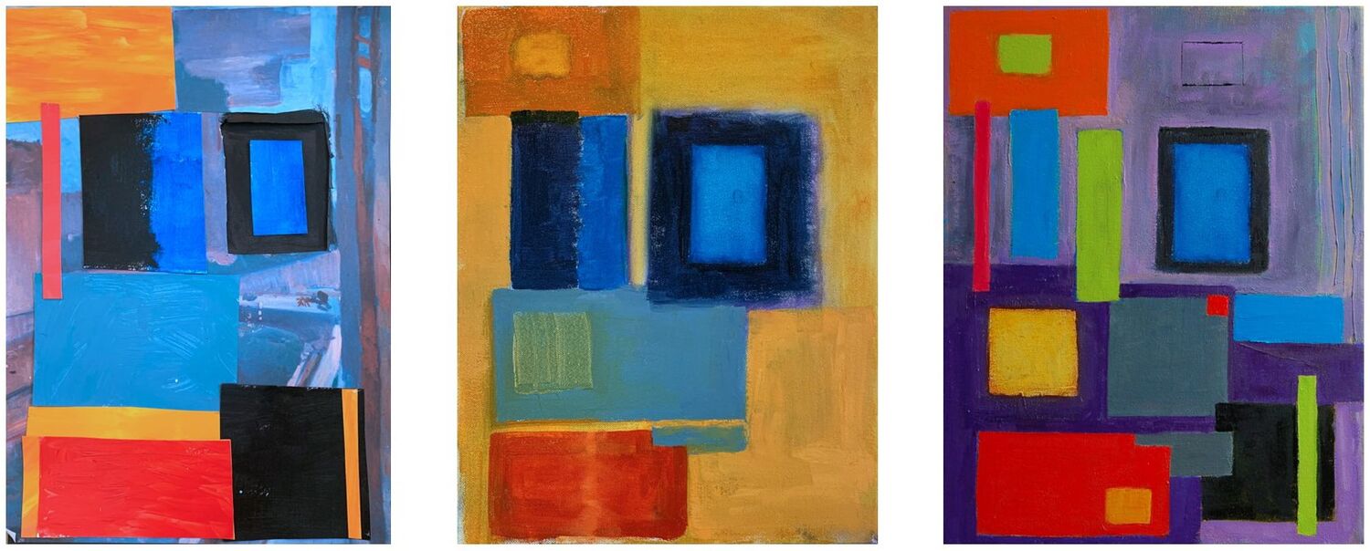
On the recent 'Freedom in Painting' workshop, held in Paxford, in the Cotswolds, we looked at the work of influential abstract painters Hans Hofmann and Sean Scully. Their contrasting ideas, methods, language, provided a fascinating insight into colour and space, pattern and repetition in painting. The workshop began with an introductory talk about their life and work, followed by a group exercise, where in a symbolic entry into abstraction, the artists collaged floating rectangles of colour over reproductions from Matisse's 'Notre-Dame' series!
 Jan Bunyan: study...in progress...final piece
The exercise was aimed at exploring Hofmann's 'Push/Pull' theory of how space, depth and motion in a painting can be affected/controlled by shapes of varying colour temperature, saturation, tone & scale, and the studies produced became the template for the first painting.

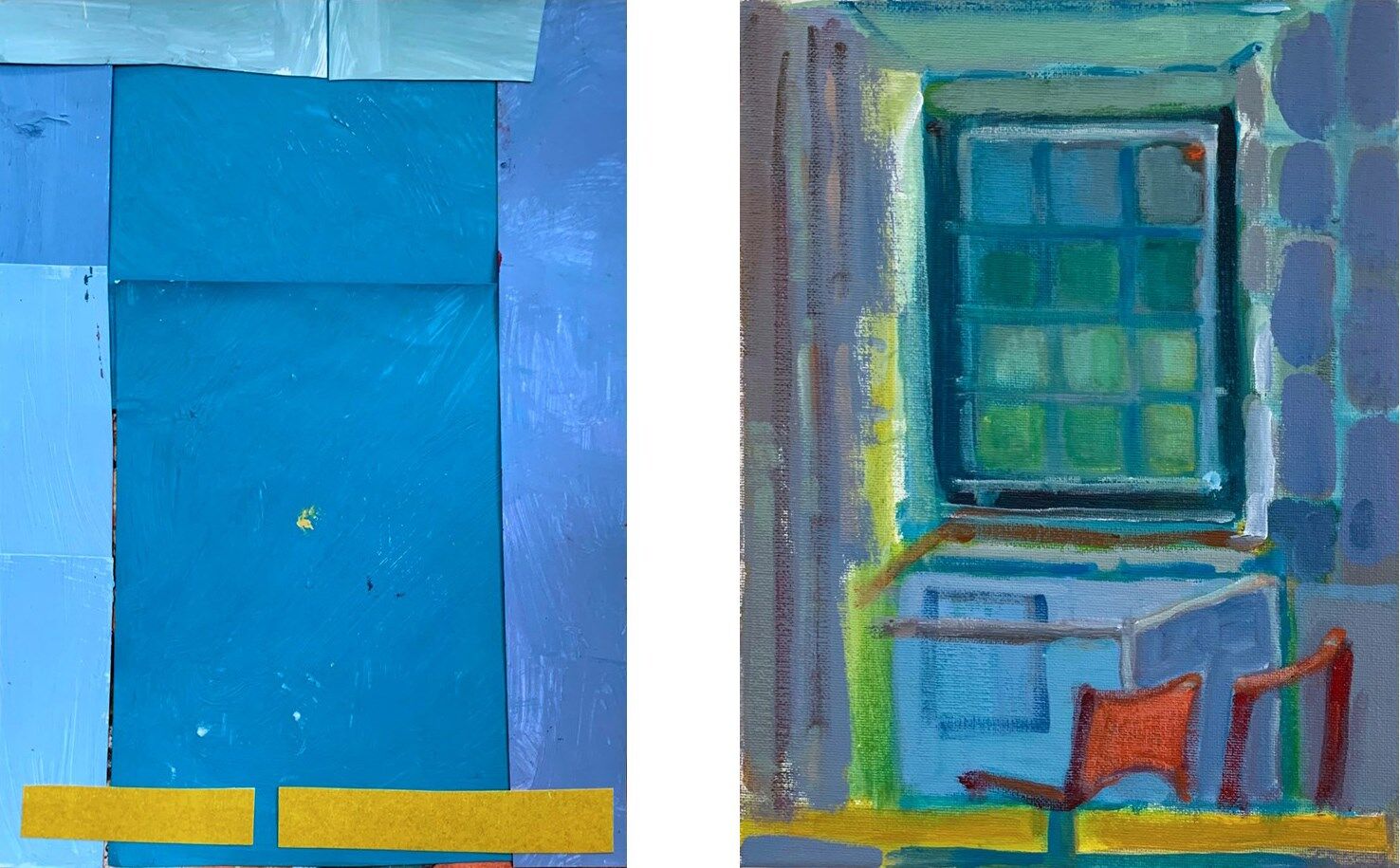
Derry Sharman: study...painting...
'I don't paint space, I paint things.' The way in to the second painting was the grid, the structure of all Sean Scully's work. The artists were asked to draw several grids/patterns/possibilities before selecting one to take forward into painting. Like Scully, some of the grids were a synthesis of life-experiences, others pure invention, but another set of strong, punchy paintings emerged. Hats off to the artists!
GALLERY

- Details
- Ashley Hanson

A re-worked top-right corner, a 'mast' on the bottom-pier and an invasion/simplification of Cerulean blue has brought a new elegance to this painting!

12 JULY 2022
Why does one go back to a painting, announced, presented, polished off? With this painting, I was always troubled by the colour, something missing between the yellow and the blue. Looking again at Matisse's 'Dance 2' and 'Music' was a reminder of the power of expressive colour. I was compelled to re-look, rework this painting. The earlier version (below) has its' own strengths, especially the colour-hum in the top right-corner, but In comparison to the final piece, it seems more polite, more static, stop/start, stop/start... I think every painting has false certainties of resolution. I feel giddy with the bravery of going back and risking losing something that was nearly there. Not really a choice though, is it?
 detail
The new oranges - slabs within curves - then a paring down of the red pier hanging from the blue, have brought more flow and glow, the weight of the central orange now dominating the drawing, giving a pure, colour sensation with the blue, 'colour that grips the eyes'. Sweeping movement from curves and line and a new optical movement of shimmering colour. The other key moves were taking out the jigsaw-shape on the top-edge with a blob of Cerulean Blue and punching through the orange line to the top of the painting, the large harbour-shape, now tilting/tumbling to the right instead of being pulled to the left. With the changes, the bottom curve is now free and a triumph of complexity, the Cobalt Blue brushmark on the right-edge more prominent. 'Five Piers', now, is less graphic, more a painting, with an exciting vitality and punch. Less detail, more colour...love it!

- Details
- Ashley Hanson
V
We recently held our 5-day 'Freedom in Painting' course in Port Isaac, welcoming a group of nine artists from around the country. Our base and studio was the wonderful Port Isaac Village Hall, but as usual, we spent the first day on location in Trebarwith Strand (below) and then on to Bude, giving our group a wide variety of coastal landscape and location to feed into their paintings.

On the 'Freedom in Painting' courses and workshops, I often introduce something that I'm thinking about and exploring in my own work, and this year I asked the artists to consider geometry and gesture in the landscape and the contrast between the natural and the man-made, and how to find different marks or tools to reference the difference. Throughout the course, I asked to include to include a man-made element in all their work, both as a contrast and a means of control of the painting.

Drawing from the landscape is a fundamental element of all our painting courses in Cornwall, information + imagination, our way into painting. After our field-trips to Trebarwith and Bude, on the morning second day, after setting up the studio, we set out to draw Port Isaac, from a multitude of viewpoints, working around the filming of the last series of Doc Martin!

Back at the studio, I gave a talk and demonstration about expressive painting, gestural marks using the arm, the body, that can be used o mirror the movement in the landscape. The group exercise that followed was a great way to loosen up and make new, unpredictable marks to start a painting. And paint we did! For the next three days there was a fantastic, infectious, intensity of working in the studio, punctuated by plenty of one-to-one tuition and further demonstrations, where my own piece gradually emerged, with the same doubts, wrong-turnings and dramas as the other paintings in the room! (See: 'Port Isaac (The Architecture of Sky)' )

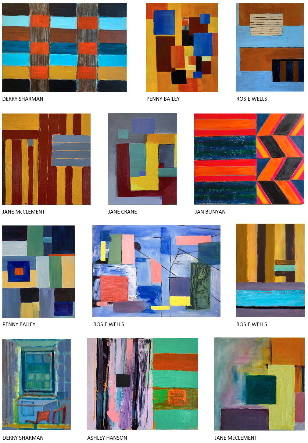
As always, it was a revelation to view and discuss the paintings in our group critique at the end of the course. Responding to place and their studies, the artists produced an incredible range of work, underpinned by the theme of geometry and gesture. Below is a selection of the paintings and we also have a gallery on Facebook, where you can see the paintings on a larger scale.
GALLERY


The course helped me to see things in a different way and focus my mind on the essence of an image. I appreciated the personal feedback from Ashley every day. I will be recommending this course to people. Henriette Busch
Brilliant as always. Antonia Glynne-Jones
I certainly found inspiration to develop my art practice, especially in the use of texture. Thanks to Ashley for another fabulous course. Hazel Crawford
- Details
- Ashley Hanson

By the studio
We recently welcomed a group of artists to our spring painting course in Porthleven, Cornwall, based in the wonderful Old lifeboat House studio at the head of the harbour. As always, the course started on Saturday morning with inspirational gallery visits: this year we saw the spring show at Cornwall Contemporary, 'St. Ives & Modern British' at Belgrave St. Ives and Bo Hilton at Tremenheere Gallery. After lunch it was back to the studio for a group painting session, exploring colour and composition.
 Drawing from both sides of the harbour
On Sunday morning, we had a drawing session around the harbour: a series of rapid sketches, getting to know our subject through drawing, gathering information and forming ideas for painting. Always good to stop for coffee and look at each others drawings.

Afterwards, I gave a demonstration about colour and mark-making. As part of my teaching, on every course I work on a new Porthleven painting for the exhibition. Below is the beginning of my yellow/orange Porthleven 57 (Ship Inn)' painting!

During the week there further demonstrations and plenty of one-to-one tuition and also a couple of couple-critiques. We also had a slideshow of paintings of Porthleven including many from our previous courses. There was was a great work-ethic and supportive atmosphere as the artists steadily built up work for our one-day exhibition. As always, it was a wonderful moment, when the studio is cleared and transformed into a gallery! This year we had seventy visitors, to the exhibition giving plenty of opportunity for the artists to talk about their work.

The ambition of every 'Freedom in Painting' course is for each artist to learn more about painting: from history, from contemporary painters, from my input, from each other, building on existing skills to make something different, exciting, interesting. Porthleven is rich with possibilities for painting: below is a trio of paintings by artist Dawn Plant, showing a fascinating evolution of translation and visual language.

As always, the artists worked hard and delivered - another great set of paintings for the ongoing 'Freedom in Painting in Porthleven' collection! Perhaps we'll see some of these paintings in the third 'Cornwall, Colour & Coast', exhibition in Henley next year, our bi-annual showcase for art made on our courses in Cornwall.
GALLERY

Thank you Ashley for an unforgettable, inspirational week. I have learnt so much from you…from starting with an amazing tour of galleries, to being encouraged to develop a freedom to be myself through art, to ending with a fabulous exhibition. I would highly recommend this course and can’t wait to come back! Dawn Plant
Ashley’s Porthleven course offers a brilliant chance for painters of any level to develop a freedom of expression in painting. Ashley is both an easy-going tutor and intense painter. He does not force any particular style but generously helps each person find their own path. I came away from the course with new skills and plenty of enthusiasm. Ben Harrison
Thank you very much for a wonderful course in Porthleven, where you motivated us to try something new in our art and I learned so much both from you and my lovely peers. I enjoyed so much trying out something new, using colours as I wanted and questioning myself how I could be unique and interesting in my art. I look forward to making art with you again, hopefully soon. Eri Kikkawa
- Details
- Ashley Hanson

SELECTED FOR BLACK SWAN ARTS OPEN, FROME. 15 JULY - 11 SEPT 2022
A painting that personifies Matisse's theory of a painting being resolved when it reconnects with the emotion that sparked it. My interest in the coastal landscape is the interplay between geometry and movement - in this case, the catalyst a white building with a triangle of blue between chimney and roof and a wind you cannot see. But this painting is also about the three-dimensionality of sky - a rarity in my work. I remembered Robin Greenwood writing about the spatial complexity of Constable's skies in Abstract Critical and the phrase 'architecture of sky' sprang to mind but not the source. Google led me to this poem by Claudine Toutoungi - perfect.
'the architecture of sky
is the song of a robin
whose Cubist grammar
is holding us up'

The painting evolved from a demonstration of gestural mark-making in the recent Port Isaac painting-course (1). How to transform an exercise into a painting? My subject (and contrast) are imposed on the painting: the wrong green leads to the red.(2). Hints of landscape. Orange lifts the red.
A dissatisfaction with the eye led downwards with the green provokes a flirtation with a change of orientation - but instead, the spring of the cut line curving upwards through the refined blue, topped by a balancing blue mark in the top-right corner, brings the painting to life.(3). The space is further opened by carving out the weighty red but the graphic chimney is an alien language for this painting (4).
A re-look at the subject brings clarity and purpose to the painting with the addition of a startling blue and a fast, leaning mark through the 'chimney' which makes the space even deeper. Now I can feel the wind...
