Blog
- Details
- Ashley Hanson
SAT 9 DEC
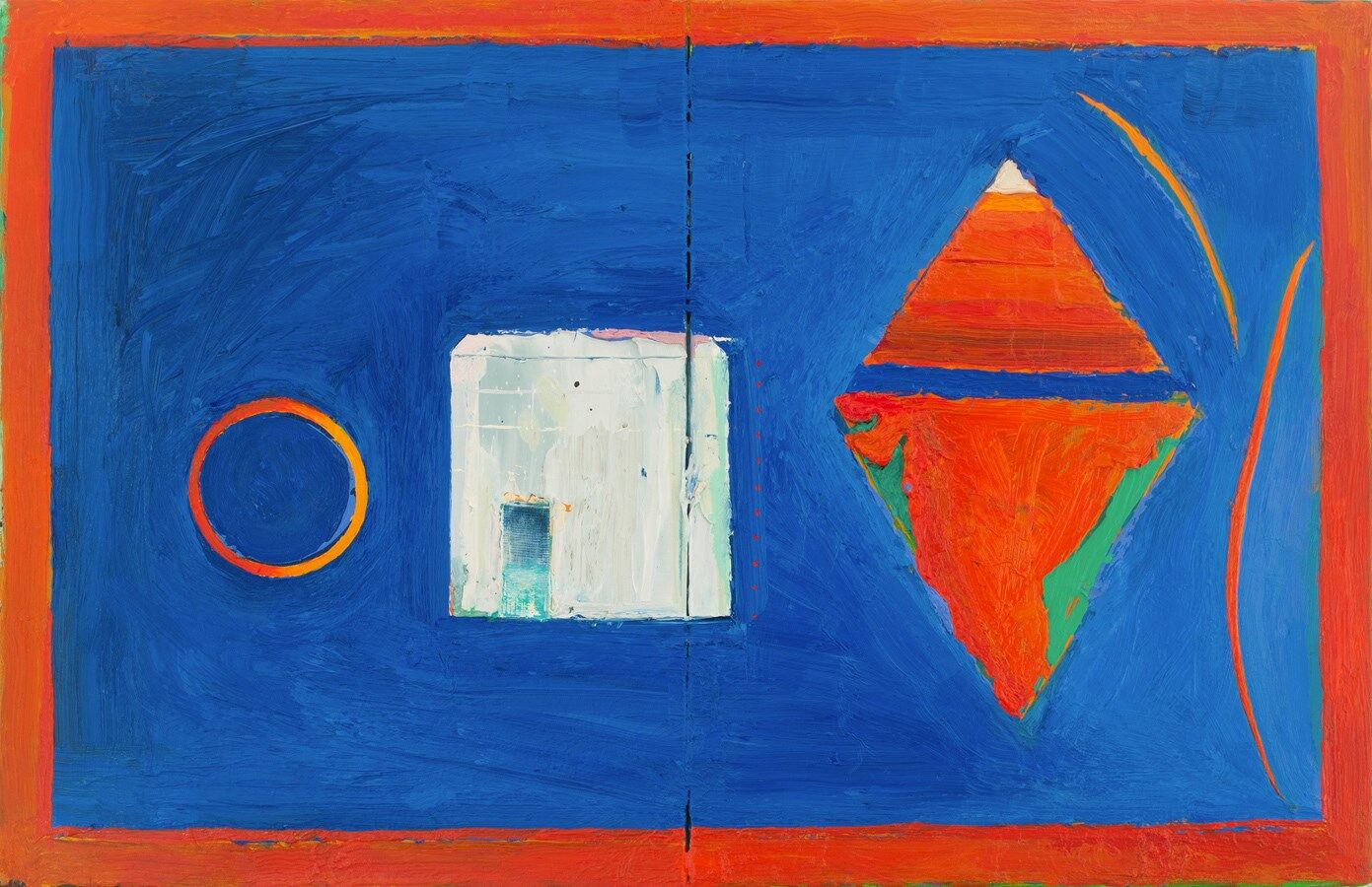
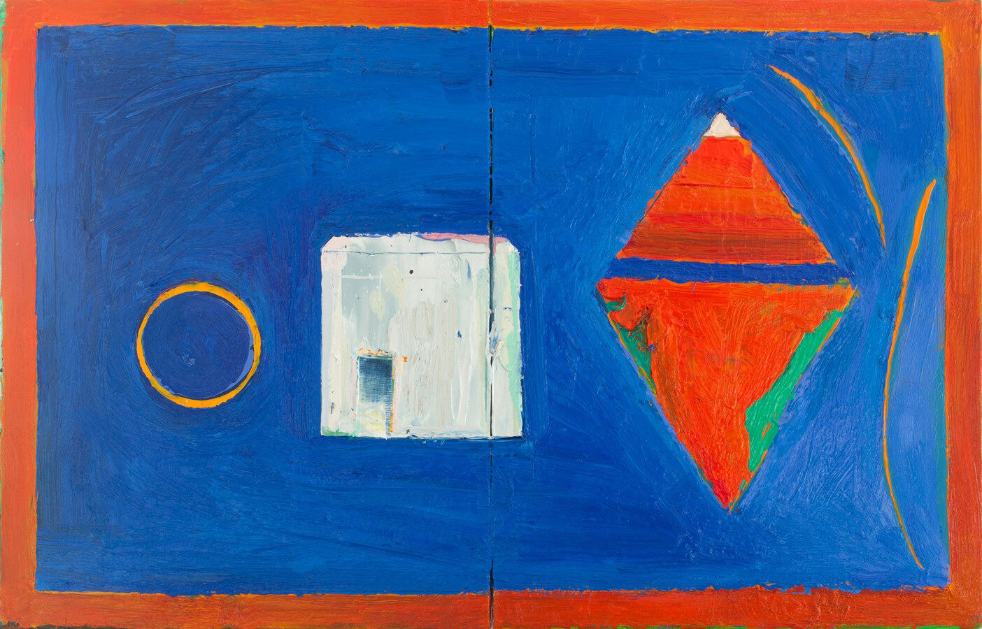
A final tuning-up of colour, especially the border, and re-drawing India - again - including a pulsating sliver of blue on the left-edge.
I'm enjoying the colour, the composition and content and the irregular, imperfect edges and tactile surface, reminiscent of a rug or tapestry. The shapes and ground are pure but not static: the paint, brushwork and colours within are moving, shifting, agitating against their containing boundaries. I considered and rejected a decorative border - let the colour sing...
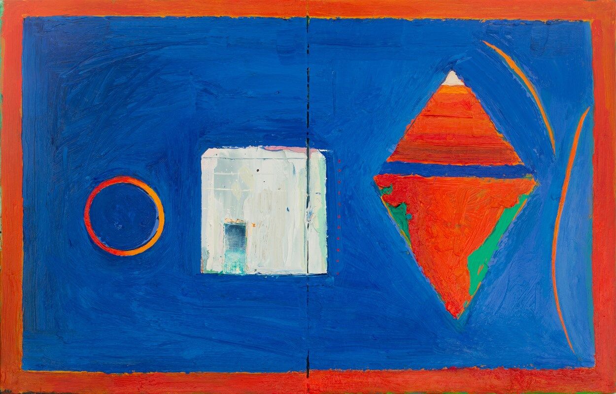
A welcome and very different addition to the '20 Books = 20 Paintings' series, now back up to 20 paintings and ready for showing in its new form.
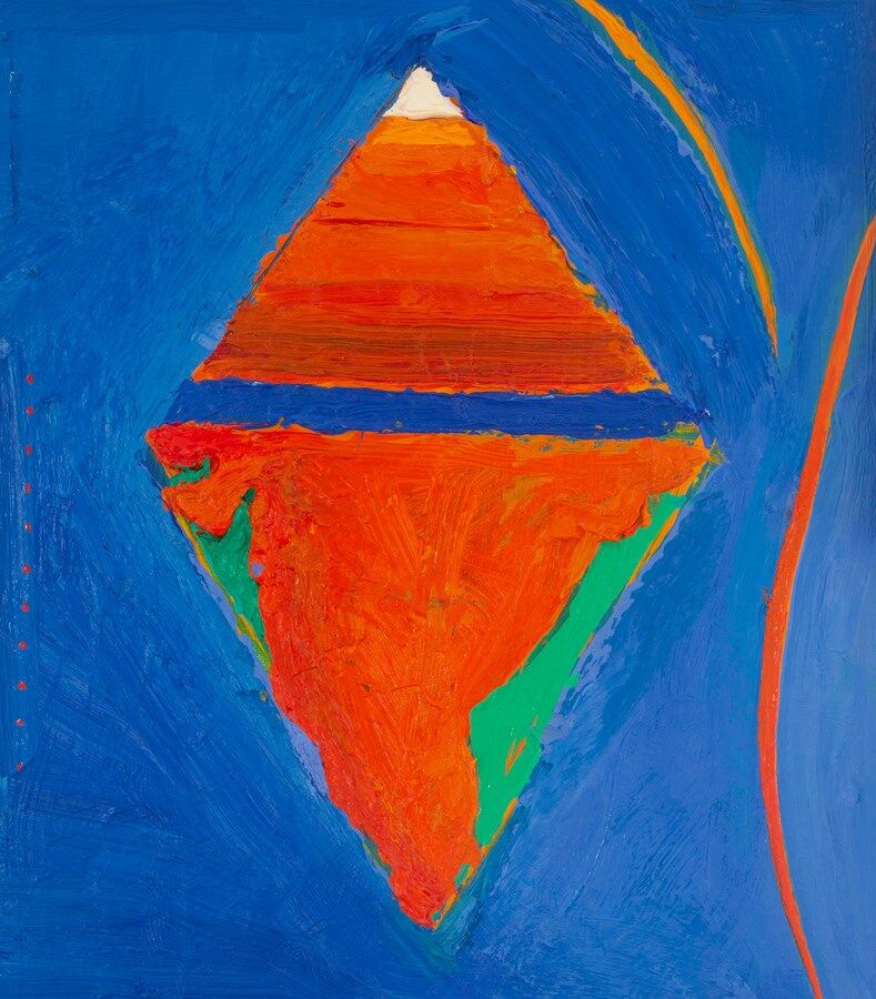
A diamond or two triangles? In Hindu symbolism, the upward pointing triangle symbolises the masculine and fire, the downward pointing triangle a symbol of the feminine and water.
 Shiva's ring of fire and Gaitonde's bunker
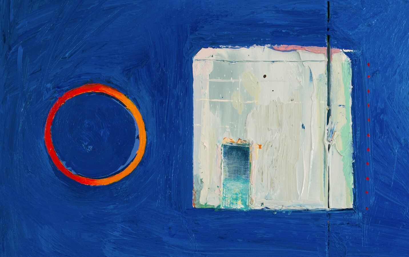
The blue of the ocean - Mumbai almost an island - the warrior-blue of the Sikhs, policeman Sartaj Singh, the blue of the Dalits (Untouchables). Muslim green, the white of the Brahmins and Gaitonde's cube, the orange/saffron of Hindus and Sikhs. I'm going keep the twin titles: 'Silence without Birds' is a quote from the novel about the aftermath of a nuclear explosion. 'Dead Dog' refers to the dramatic opening of the novel, where a white Pomeranian dog is thrown out of fifth-floor window, and also, perhaps, to Gaitonde's death in the eyes of his enemies.
 (5)
(5)
WED 6 DEC
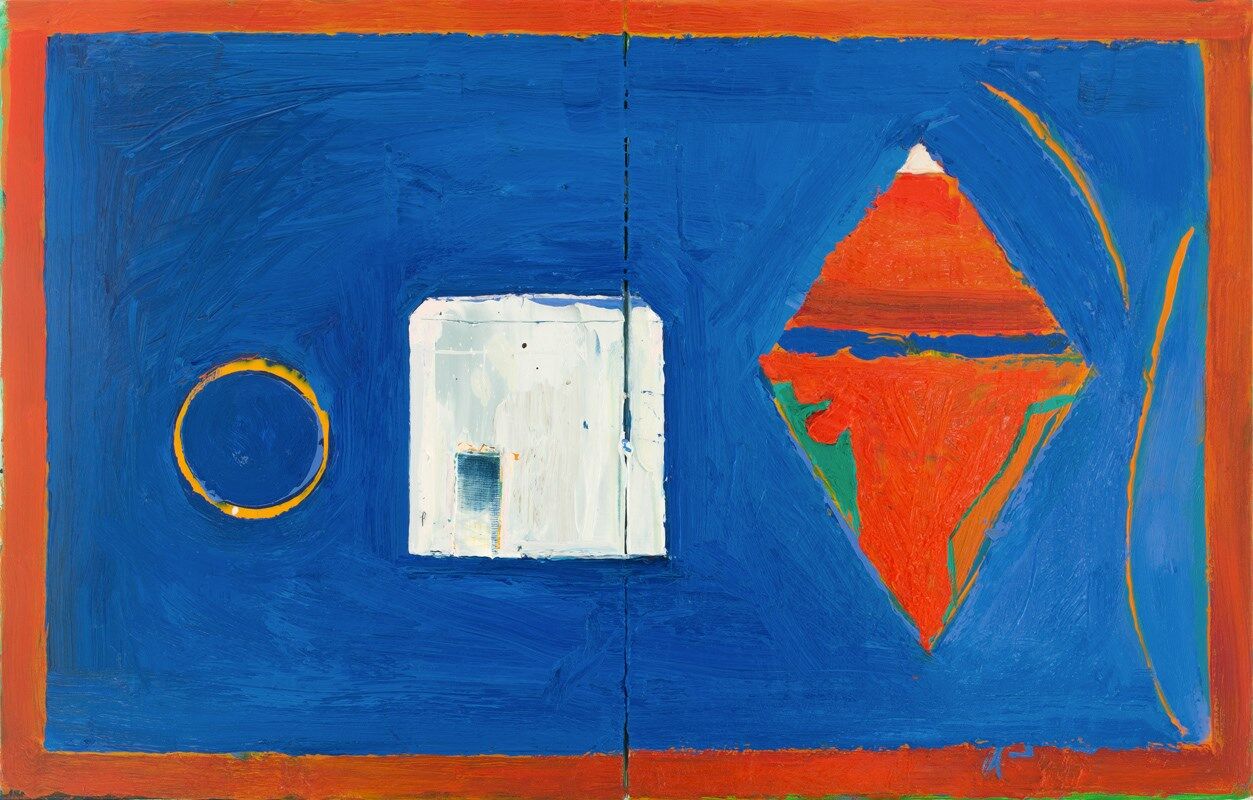
I think we're done (5). The ring of fire has a glowing presence with new orange/red. The curves on the right are now purer, sharper. A couple of touches to the building: grey in the corner to ground it, an extra white horizontal and a small white line in the top-right making it less static and just dragging the eye across. More orange around the border lifts the colour further, setting off the blues. T
 (4)
(4)
MON 4 DEC
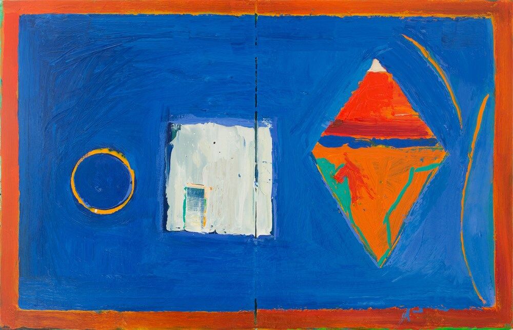
India redrawn by carving through the paint on the left, now linking to the shadow of the doorway, and a new green on the right (4). A teal dot of Mumbai, touches of pink on the white-cube. Something else needs to go in the border - something decorative? Perhaps a pattern of circle, triangle, square...
 (3)
(3)
SUN 3 DEC
Putting the 'white-cube' inside a yantra didn't work, the image became over-complicated. With new refinements and straighter edges, the building now has more presence (3). Love the simplicity of the circle - do I need to make it a circle of fire? The wobbly outside edge suggests fire, like looking at the sun. I worked into the diamond, but a bit of the life has been lost in redrawing India. Back to the studio...
 (2)
(2)
SUN 2 DEC
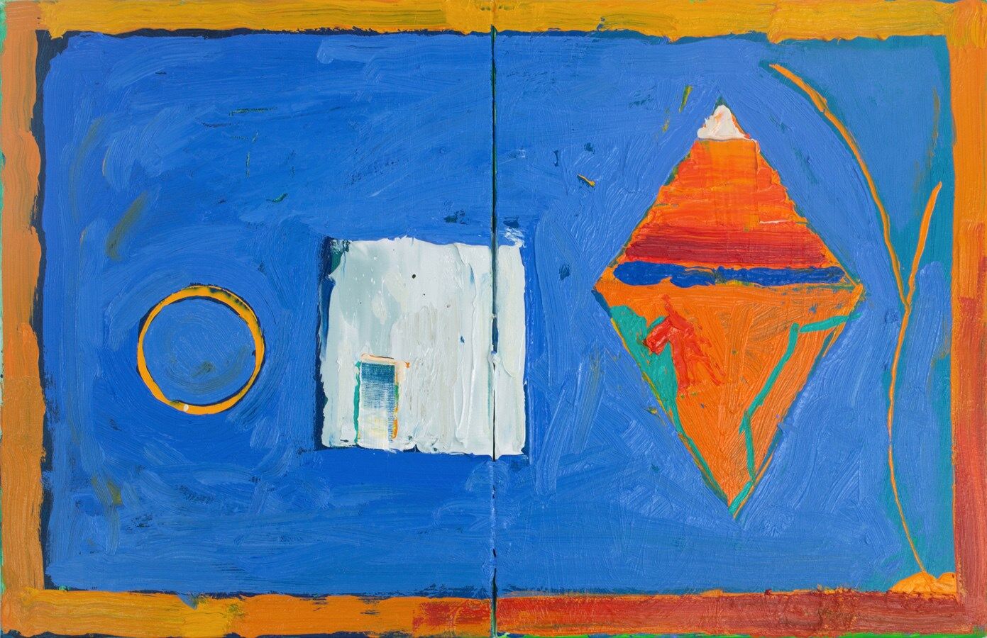
A good session (2). Denser, richer blues and refinements of the colour and precision of the border. The two saffron curves on the right now are now free and dynamic. I'm going to try Gaitonde's white cube inside a 'yantra', which are packed with geometry: the circle, triangle and square. The scale and composition of the three elements feels right.
 (1)
(1)
MON 27 NOV 23
Throwing in the kitchen sink (1): Gaitonde's 'white cube', Shiva's ring of fire, a hybrid image of the caste-pyramid and the shape of india. Hindu saffron, Muslim Green, Dalit blue and the blue of the Indian Ocean, with a nod to the decorative borders in traditional Indian painting...
- Details
- Ashley Hanson


We have been hosting 'Freedom in Painting' courses at the Old Lifeboat House in Porthleven since 2013 and we recently welcomed our latest groups of artists to the Autumn courses, both ending in a final-day exhibition, showing the fantastic work made during the week. Our inspiration is Porthleven, which never fails to inspire, with the complexity of the harbour, iconic clocktower and ever changing light, tide and weather. You cannot beat making art to the sound of the sea!

The course always begins with a visit to the galleries, so on Saturday morning we headed to St.Ives, with a relaxed brief of the views through windows, and the idea of framing image and paintings within paintings. We all enjoyed the vibrancy of the Casablanca Art School at Tate St. Ives, the Members exhibition at the Penwith Gallery, Paul Wadsworth at the Crypt Gallery and visits to the studios of Heather McAlpine and Lynette Pierce.
Back to the studio for the first group exercise, responding to opposites/pairs/dualities, transforming words into marks. This became the startpoint for the first painting.
 Exercise and group-critique
On Sunday morning we had a drawing session around the harbour, taking in a many viewpoints as possible, getting to know Porthleven through drawing, and looking for ideas for paintings.

For the afternoon painting session, I handed out reproductions of Mondrian's 'Composition with Blue, Yellow, Red, Black and Grey' (1922). This was to be start of the second painting! The artists were asked to 'copy' the painting onto their own canvas, which of course presented an opportunity to mix their own blue, yellow, red, black and grey (and white).

The idea behind the exercise, was to provide a strong structure to their painting, a new beginning which could lead to a different painting. Plus of course, the possibility of a window, a painted border, a painting within a painting, The artists were asked to look at their drawings, find a connection and find a way to use the grid or simply place a drawing inside the 'window' and take it from there. As you can see from the gallery this led to some very inventive paintings.

Jon Hastings & Dawn Plant from the September course
The next few days were packed with one-to-one tutorials and demonstations, as all the artists, including myself, worked hard towards the exhibition. Certainly a place to be brave, to experiment, to leave the comfort zone, with the ambition to learn and make paintings that showcase all our skills, express our ideas and emotions, responding to our magical subject, Porthleven, in all its moods.

We worked until mid-afternoon on Wednesday, where we transformed the studio into a gallery, hanging the exhibitions amicably as a group. Always a revelation - another piece of art! The exhibitions were very well received, with the artists enjoying the opportunity to chat to the many visitors about their work and the course.
The October course coincided with the Porthleven Arts Festival, and we were very pleased to be involved. On the courses, we had sunshine and record temperatures, and storms, sometimes on the same day, the beauty and drama outside, captured on canvas by our talented artists, who, I'm sure, will continue to paint Porthleven from their memories and drawings wherever they are. Hats off to the artists!

ARTISTS COMMENTS:
'A pleasure working with a lovely bunch of people - inspiring to see all the different responses to the brief and Ashley was, as usual, very helpful. I particularly enjoyed the Mondrian brief' ERICA SHIPLEY
'Very useful. Helped me move forward and it was instrumental in hepming me improve my abstraction' ROGER WILKINS
'it has been another great week in Porthleven with the group. Intense and fun' LESLEY TURNER
'Ashley gave a lot of individual help and evaluation which was very helpful. I came on the course wanting to move from 'semi-abstract' to abstact and the course helped with this. I liked the two exercises about how to start a painting' BARBARA ROBJANT
- Details
- Ashley Hanson

SAT 7 OCTOBER
A painting that feels on the edge of danger... and flamboyance, the twin rose lines almost decorative. Colour or sea - which is the stronger? Dense reds and greens, jostle and pulsate, the forceful sea batters - something- threatening to overwhelm. The tall black bar is both a solid and liquid, a different strength, a holding force amongst the surrounding chaos.
A physical piece: paint punched and poured, gouged and cut, aiming to match the physicality out there, the elemental forces of wind and water...

With the bad weather, the red ball was raised on the pier and the dark baulks lowered into the gap, to protect. But the waves pounded, almost over at times. Tension - different strengths, pushing.
This was the idea for the painting, re-inforced by two drawings, with the triangle of the side of the slipway in shadow prominent. The turning point in the painting was changing the orientation to something less literal, more powerful.

A companion piece to 'Porthleven 60 (The Gap)', looking the other way, from the back of the harbour to the open sea.

The soundtrack for this piece was, appropriately, the raucous, scathing, romantic, visionary, uplifting 1985 album by The Waterboys, 'This is the Sea'. .We're going to see them next week in York and catch up with Ollie.

- Details
- Ashley Hanson

'Porthleven 70' will be on show at the Old Lifeboat House, Porthleven, where it was made, on Thurs 5, Fri 6 October.
20 SEPT 2023
The 70th painting in the 'Porthleven' series - a landmark. Epic reds and writhing blues collide: a synergy of boiling emotions and boiling sea, the force of colour, the force of nature. Made in the Old Lifeboat House, with the sound of the sea a constant. When the sea is wild, the red ball goes up on the pier...
 (4)
(4)
Shape and elegant line - below (2) - were never enough. The introduction of the heavy blue (3), brought tension, infiltration, threat... then the reds were overwhelmed (4) before new reds flooded the top-left corner. Now the central cadmium-red pushes back against the blue. Who's the daddy now?
 (2) (3)
I brought anger to this painting - how do you become visible as an artist? - it was always going to be red, informed by a simple-drawing (1). The pink underpainting was the worst preparation, so before the reds came blues and greens. Find contrast in red, find a shape...A fabulous shape emerged - angel wings, but a too-sweet blue (2): after all, this is Porthleven...
R.E.M's awesome reflective, melancholic 'Automatic for the People' was an appropriate soundteack to this painting,
 (1)
(1)

- Details
- Ashley Hanson

‘Repetition in painting can be pattern but also much more…
Repetition can be symmetrical or asymmetrical…
Repetition can bring order and structure, unity, rhythm, and movement to a painting..
It can be the subject of a painting…’
The latest 'Freedom in Painting' workshop was held recently at the Queens Park Art Centre in Aylesbury, exploring the idea of 'REPETITION', a theme put forward by one of the 11 artists taking part.
Of course 'REPETITION' in painting can be dull . My intial thoughts were of tedious spot paintings, Carl Andre and the worst of minimalism but then I remembered the strange and wonderful 'The Cholmondeley Ladies' and the deeper I looked into the subject, the more fascinating and richer and varied it became, also making me aware of the subconcious repetitions in my on work.
 The Cholmondeley Ladies
The workshop began, as always, with an extensive talk referencing the different kinds of repetition in art history, taking in Pre-Columbian and Islamic art, Monet's haystacks, Warhol, Duchamp, Mondrian, Klimpt, Joseph and Annie Albers, William Scott and the work of several contemporary painters including Helen G. Blake, Sarah Morris and Jennifer Durrant.

This was followed by four quickfire exercises, looking at repetition in the grid, shape (circles), mark-making and movement, with the aim of each artist finding a particular direction to explore further with the ambition of making 'REPETITION' inventive and interesting! On a demonstation after lunch, I chose 'repetition as movement', with a repeated motif of Porthleven harbour. Early days - watch out for developments soon.

As you can see from the selection of paintings above, each artist followed their own path over the 2 days, some working from ideas and studies brought to the workshop, others spingboarding from the morning exercises, with some very imaginative processes and results. Brenda Hurley cropped her original study into five seperate compositions (below) to inspire her painting.
 Brenda Hurley - studies
Three artists worked in a diptych format, allowing further posssibilities for their painting. I'm still not sure which version of Mitzi Delnevo's painting of the long pier in Porthleven I prefer - no, it's the one of the left, full of movement...
 Mitzi Delnevo
I very much enjoyed my tutorials and conversations with the artists during the two days and seeing the paintings develop. There was a fantastic creative energy in the studio, with all the artists pushing their work and also learning from each other, taking advantage of precious time devoted exclusivly to painting. Late on Friday, we finished with a group critique, always enjoyable, with insightful comments and contributions from all the artists.

Before the workshop, I never really connected to the work of Josef Albers - repetitions of squares within squares - but I was enlightened to discover in my research their fascinating source in the temples of Central America. Below are some of his perceptive thoughts on the essence of Art:
Rational functionalism is technique,
Irrational functionalism is art.
Art is creation
It can be based on but is independent of knowledge.
We can study art through nature,
but art is more than nature.
Art is spirit
and has a life of its own.
Art in its nature is anti-historical
because creative work is looking forward.
It can be connected with tradition
but grows, consciously or unconsciously out of an artist’s mentality.
Art is neither imitation nor repetition
art is revelation
ARTISTS COMMENTS:
'Thank-you - what an inspirational and confidence-builder the course was! Ashley was hugely kind and generous with his feedback and pointers' HELEN SAVIN
'Very interesting and Ashley is incredibly generous with his time, commitment and help. By far the most enjoyable course I have been on' KAREN JOY
'Ashley gave very individual feedback which helped me develop my own responses to my work. The course was very positive' ANNE MARIE HOLLOWAY
'Thank-you. I feel I have moved forwards as an artist' FIONA WILLIAMS
'I enjoyed the intro. talk and learning about new artists. Warm up exercises valuable' MARION OWEN