Blog
- Details
- Ashley Hanson

13 JULY 2024
Transformation: a too-heavy red replaced by dazzling blues, a redrawn harbour and adjustments elsewhere and the emergence of a beautiful painting...
 October 2022
- Details
- Ashley Hanson

In early May, we welcomed a group of 9 artists to our 'Freedom in Painting' course in Port Isaac. As you can see from the galleries, our artists were truly inspired by the Cornish coast. We met up in blazing sunshine in Trebarwith Strand for the morning drawing session, the artists capturing the drama and movement of the onrushing tide, with brooding presence of Gull Rock offshore. The loose theme for the course was 'Repetition' and the artists were asked to look for repetitions in the landscape, giving them something new to think about in their drawings and paintings.
 Sketching at Trebarwith Strand & Antonia Glynne-Jones' sketchbook with Gull Rock...
After an excellent well-earned lunch in the Port William Inn up on the cliff, we headed off to Bude our second location, a very different landscape with its meeting of sea,river and canal and wide sandy beaches. We were of course, getting to know the landscape through drawing, and looking for ideas for paintings and the Sea Pool in Bude, below, became a popular subject.
 Sea Pool, Bude
The following morning we set up the studio in the wonderful Port Isaac Village Hall and began with a quick group exercise before heading out to explore and draw around the harbour in Port Isaac, again with the idea of repetition in mind. If you look for it, you will find it everywhere...
 Port Isaac
Back at the studio after lunch, I gave a talk about the use of repetition in art history and in a few of my paintings that I brought along. After another group exercise, it was time to begin translating the ideas and drawings/studies into paintings and I began my rounds as a tutor, discussing ideas and the paintings, offering encouragement!
 In the studio...
Over the next few days, it was great to see the beautiful colours and marks being made and the paintings emerge. A rare time for most of us of pure, uninterrupted time for painting, where of course, you can go far. They were a fantastic hard-working group, willing to push their painting into unfamiliar territory. We had a few laughs aswell and a very enjoyable evening out together at The Old Chapel. As always, on Sunday afternoon, we finished with an extensive Group Critique, sharing views on each others paintings and enjoying them too. Hats off to the artists!
 Artists dinner

ARTISTS COMMENTS:
'Really great course.Enjoyed every minute. really good tuition' BARRY KELLINGTON
'I really like the format where we go out and draw and then paint from our drawings. Ashley is always extremely helpful back in the studio, discussing where we want the work to go, providing great feedback and encouragement' ERICA SHIPLEY
'All brilliant! Thanks to Ashley for pushing me to new limits of abstraction.' MARION OWEN
'Loved the initial drawing exercise searching for triangles - and the walkabout with Ashley - giving my eyes a spring clean. Loved Ashley's emphasis on how to make a painting interesting as opposed to literal with the emphasis always on authenticity of experience and a sense of place. Appreciated all the personal guidance that Ashley gave throughout' ANNA BADAR
- Details
- Ashley Hanson

WED 10 JULY
I took this painting further today. Putting aside the emotions projected in (4) - and the drawings - I sensed the painting was too busy, too symmetrical, the marks floating on the surface, the bottom curves somehow separate, taking you out of the painting, The sea is now darker, weightier, more menacing, belonging. A flood of orange, a new turquoise, purple over green brings greater colour-drama and a curious light, the bulge of the orange redraws the harbour-shape, adding to the rhythm of curves within the perfection of the square. Ripping, peeling, pouring: history revealed, more depth, new shapes.
The painting seems more complete, surprising and...and..and... unexplainable. Walk away...

detail
 (4)
(4)
WED 12 JUNE
Went in again with new central stripes (below). Denser colour, more painterly, the Ship Inn, the 'eye', more prominent. The painting is raw, visceral, capturing the physicality, drama and movement of the subject. One of my best, the antithesis, I hope, of the 'tepid, polite and pointless' work described by Jonathan Jones, (Art Critic, The Guardian) in his recent acidic review of the Summer Exhibition (See: Royal Academy Summer Exhibition review – a gasping death-rattle of conservative mediocrity )
Dear Jonathan,
Your scathing article about the RA Summer show was a reminder of what is shallow and what is real - I would like to shake your hand! I considered changing the title of this painting to ‘Varnishing Day’ as my own two-fingered gesture…
Best wishes, Ashley
 (3)
(3)
MON 10 JUNE
I'm giddy with excitement: going back to the painting - risking all - has transformed the piece (3). The violence of the the sky now zigzags downwards in the harbour shape of Porthleven which sits cradled by the raging sea, linking top and bottom, disrupting the polite, almost decorative stripes. The painting below was anchored in too many places, now it's full of constant motion and menace...
Love the way Porthleven is now pivoted on the central red bar/pier, the gestural marks now have a formal, visual purpose, establishing scale and context: the existential threat becomes real...
 (2)
(2)
SUN 9 JUNE
The sky crackles with electricity, an apocalyptic sea, the Ship Inn the eye of the storm...
And yet... I'm still looking. Love the sky, the spinning internal frame, the concept and presence of the white dot/Ship Inn as the eye of the storm, and the red brushmarks charging across the canvas. But there are questions:
The dark marks of the sea are beautiful in themselves, but not menacing, almost narcisisstic, aloof. The paint in the harbour-shape and the surrounding greens (below), although raw, have more chararacter, are more distinctive. I cannot work out my 'harbour-shape' in the above, and it worries me. Above all the violence of the colour in the 'sky' doesnt extend into the bottom two-thirds. I don't like the 'wave' drooping downwards in the bottom-left corner. Time to clean some brushes...
 (1)
(1)
 studies
- Details
- Ashley Hanson

SEPT 30 2024
The 'boat', centre-right was always too static and a distraction. Now replaced by transparent blues and a central red to imply the harbour-entrance...and safety.

MON 3 JUNE
A return to 'STORM!!!' this week, bringing in more movement and menace and ambiguous scale, no longer a spectator but in the storm. Enjoying the new highlight - hope/escape? - sweeping, gestural, emotional marks replacing the linear orange, green and white which seemed to stabilize the painting...

 (9)
(9)
FRI 26 APRIL
I began to question the green-line angling downwards and it's starkness. It's now been straightened, darkened, softened. Much more subtle and painterly now, the line having its own interest and yet integrated more into the painting. The final mark a deep transparent purple curve across the blacks at the bottom.

(8)
MON 1 APRIL
With the changes today, this orientation (8) is a revelation - sea becomes sky - and the painting is now something I feel I can walk away from. There is a fabulous relationship between the dancing purple curve and the orange and green. As a portrait (7), the green line became too strong and the new curve didn't seem to make sense, frivolous, almost decorative, bulging away from the dynamic...
Going back to my original thoughts about heavy purple skies, love the weight and volume and menace of this one, vast and three-dimensional, held and balanced by surging, black water. Image and scale are elusive and ever-changing - sometimes inside the harbour, sometimes outside - adding to the pleasure. A curiosity in my work: entering the painting from the right. Welcome to the storm, we are in it, we can feel and hear it, a painting, I hope, in the spirit of Nolde and Joan Eardley. (made in the safety of the studio!)
 (7)
(7)
I nearly stopped at (6) but went looking for more drama...

(6)
SUN 31 MARCH
I'm coming to terms with the changes (6): less movement but more perhaps more omininous? Time to fix the green line - I'm missing the clarity of the green line, something is lost in its relationship withe orange. The painting also needs a curve, perhaps a swirling mark across , purple into black. Getting close..
 (5)
(5)
The blacks become too solid a shape in (5) and the blue of the zigzag seems alien. But now I see the zigzag leading the boiling sea through the gap towards the piers belong. We - as viewers - are in the water...
 (4)
(4)
Interesting this way up (4). A shift in scale...does the 'clocktower' on the right makes the waves bigger, the storm stronger?. Below is more about feeling, in the storm rather than observing. Enjoying the role of the structure in both, perhaps more contained above and dangerous and fragile below...
 3
3
SAT 30 MARCH
A couple of weeks away from the studio, a blank canvas - it's scary stuff. The studio is a lonely place. It took 'Fisherman's Blues' by The Waterboys to get me going. Three sessions today and progress. The idea of 'storm' - wind, weather, wild sea, menace, weight, movement...
I love those those heavy purple-grey skies so thought I'd take that as a palette. I tend to work with opposites, hence the green backgound, Speedy gestural marks in (1) - looks like a garden! - then a reveal of hidden masking-tape harbour structure (2), before it's overwhelmed in (3).Love the new, central black: Ultramarine Violet and Alizarin Crimson. Looking good.

- Details
- Ashley Hanson

SUN 26 MAY
The painting felt a bit raw, sketchy, the yellow drips a distraction (7) so I took them out and brought in refinements of line and colour, including new slabs of punchier yellow. Now the painting feels more unified, the surface knitted together. Love the repetion of the small yellow window, the larger 'possibility of window' and the facade of the beach huts.
 (detail)
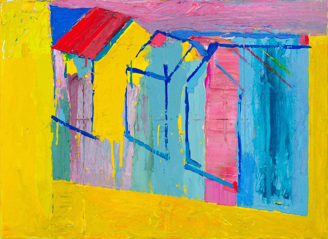 (7)
(7)
SAT 2 MARCH
We're done (7). A diagonal flash of yellow on the right-side - opaque to transparent - and a new pink stripe on the roof on the left, echoed by a spot on the right.
The title 'Window' refers to both inside and outside: the idea of a 'view' through a window and the accidental yellow window in the beach hut on the left, formed as a consequence of the painting around, Or is this a painting of a painting on a yellow wall? Bit of Bonnard in there, bit of Matisse...Looking forward to seeing the beach huts in Brighton this week when I visit Kellie Miller Arts Gallery...
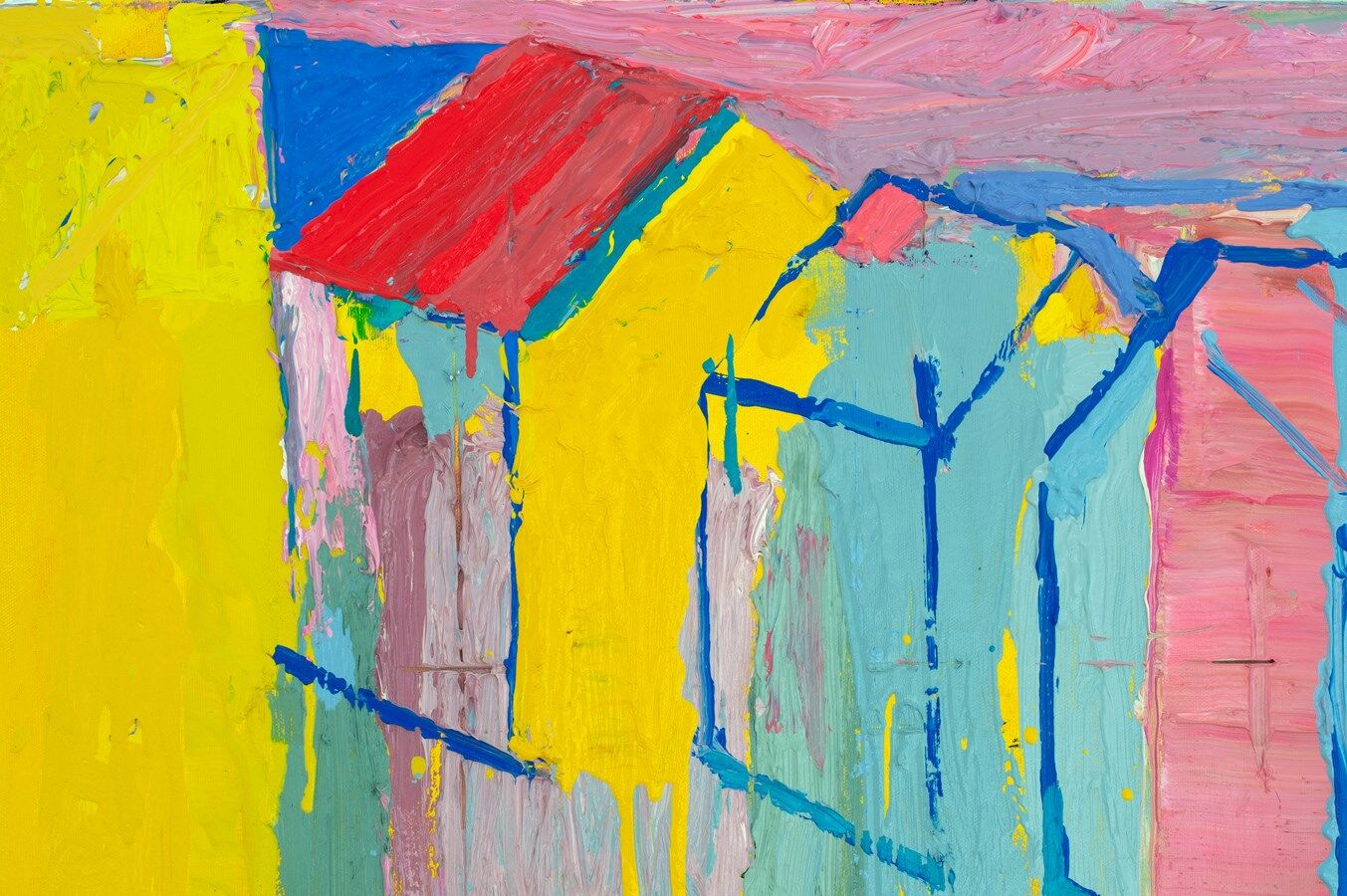 (6) detail
Incredibly, over 4 days I used 27 brushes, 6 palette-knives & 13 paint-pots!
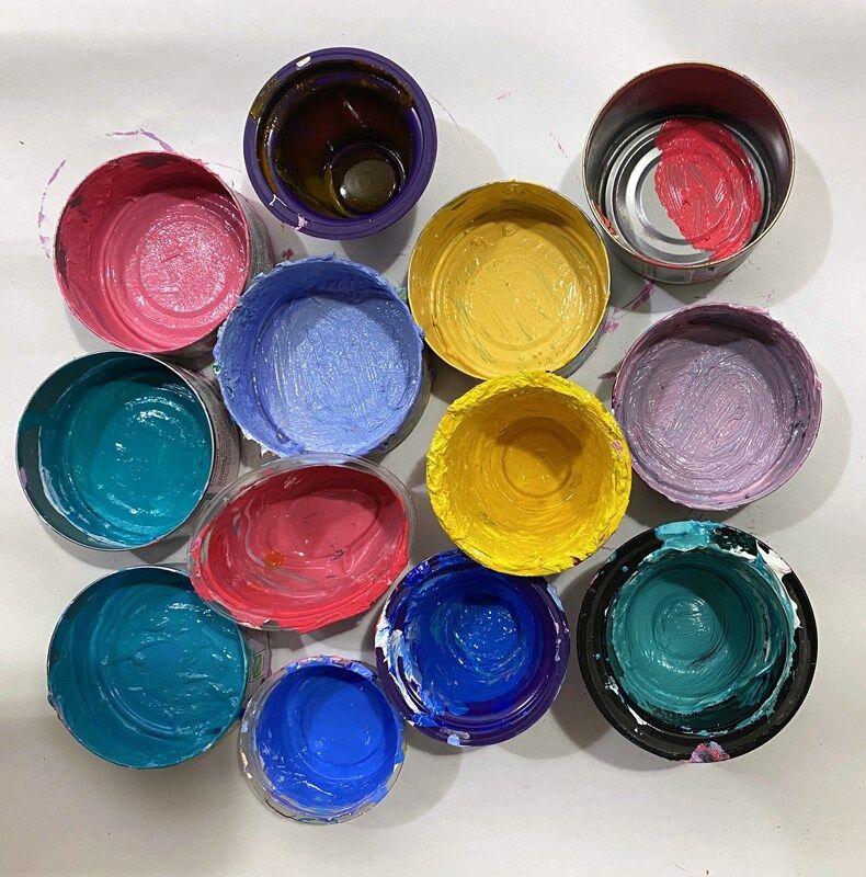 (5) paint pots
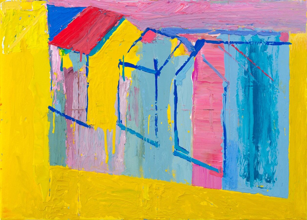 (4)
(4)
FRI 1 MARCH
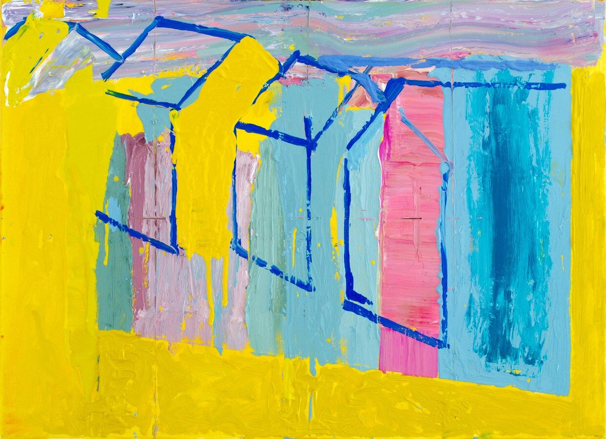
A good session today (4). There is a strength in the composition and a delicious tension between freedom and control - a bit of over-editing or a mark too many could kill the piece...
I'm enjoying the transition and balance between the solid shapes in the top-left and the more open centre. That blue triangle is daring and the yellows sing among the more subdued complimentary mixes. I've softened and refined the drawing - now the huts are grounded - breaking the lines in places, allowing more flow around the painting and giving more emphasis to the angled lines and diagonal movement.
 (3)
(3)
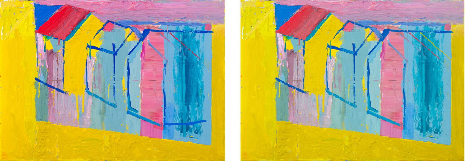
I often work on my painting in the evening on Photoshop, trying out ideas. Here you can see the effect of a single line on the painting.(3). On the left, the new blue line in the bottom right corner, almost forces the hut to bulge outwards. On the right, the thin yellow angled line coming in from the right edge, makes the 'frame' flatter, more ambiguous and brings a touch of yellow into that part of the painting.
 (2)
(2)
THURS 29 FEB
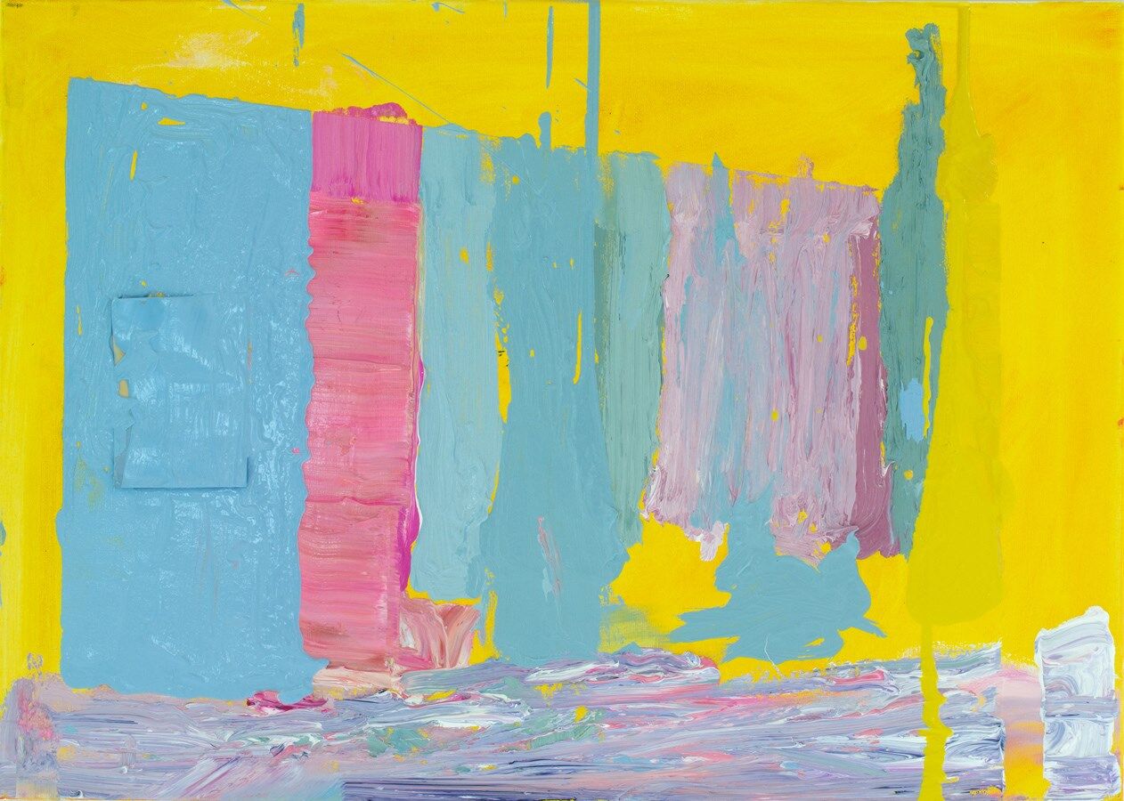
A line of linear beach huts provides a structure within the structure.(2). Since my art-college days, living in Whitstable I've been fascinated by beach huts, their individualism, quirkiness and fragility. It's important to express this in a painting and I think it's happening here, alongside the geometric possibilities. I've thought for a while the 'Beach Huts' series needed a larger piece.
Got to keep the strangeness, the tension between image and abstraction, there is no point in painting the world as it is...
 (1)
(1)
WED 27 FEB
Enjoying mixing new colours and laying them down on a backgound of scrubbed down Michael Harding Transparent Gold Ochre...(1)