Blog
- Details
- Ashley Hanson
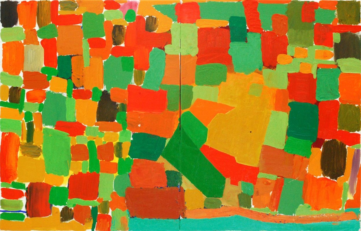
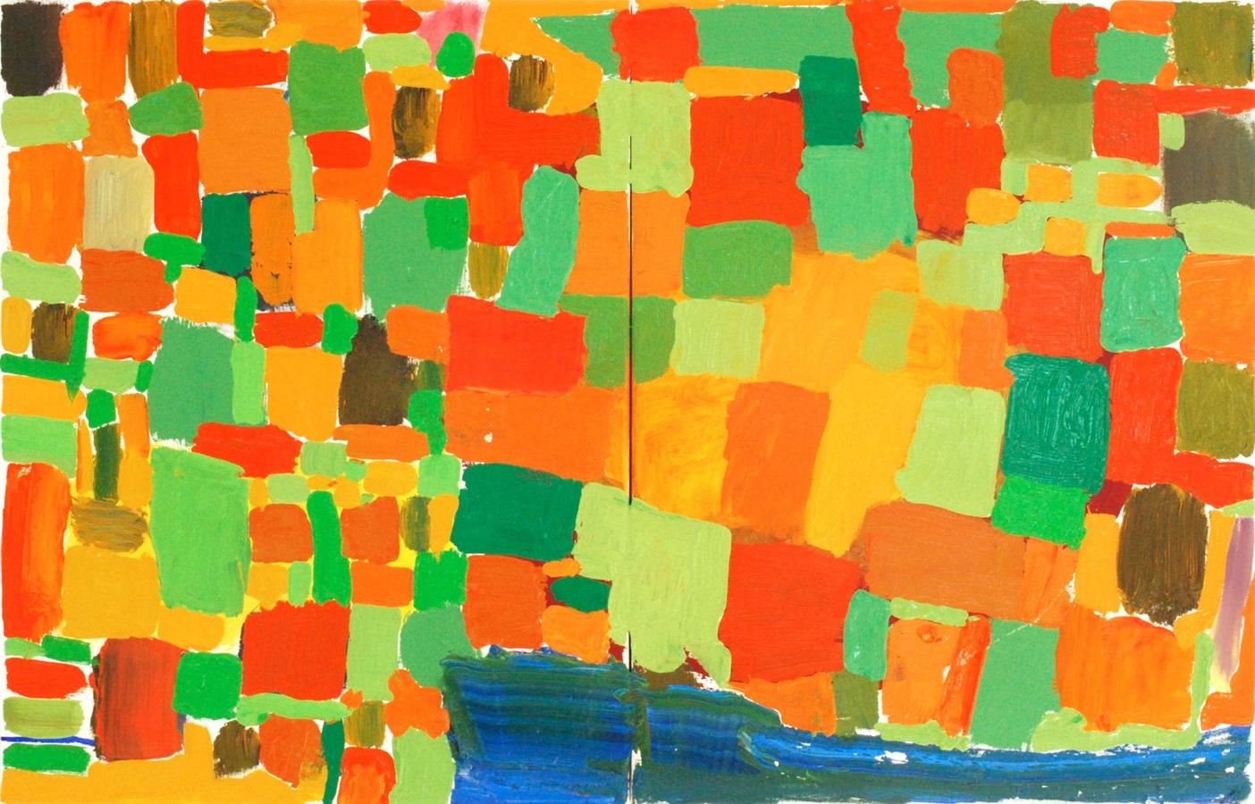
'BOOK 8 - (smile)' 45x70cms oil on canvas
SAT 14 DECEMBER
The blue was a distraction (see below)
From the pure enjoyment of mixing and placing colours to a tougher painting with the introduction of specifics from the novel, the essence of the novel, locked into the language but with a different presence...
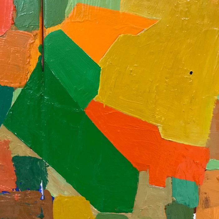
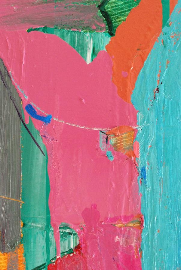
detail
The only hard-edged shapes in the painting, enclosing an emptiness of yellow with a solitary dot, like a bullring at noon...(an observation, not a clue)
- Details
- Ashley Hanson

6 MARCH 2021
The curves of 'the beast' are now more prominent and flowing better across the canvas...Orange to red and a swell on the top-right horizon.

BOOK 7: Re-visited, December 2020
Possibly the painting that has changed the most during the recent reflections. I thought the version below was confusing and the language too close to the work of Howard Hodgkin. The painting now better reflects the apocalyptic darkness that permeates the novel.
After toying with 'Retribution', 'Retribution Blues', 'Mood Indigo', we have a new title 'The Beast from the Sea', which works on several levels in the context of the novel.

MON 2 DEC
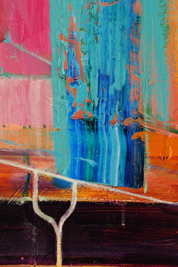
Looking, brooding over the weekend...brought in some different blues today, cobalt and cerulean, working mainly around the perimeter with cascading shapes and fast marks creating more movement. There is also a new, subtle but critical reference from the novel which of course I can't talk about until the series is complete! I think we are there...
 detail
SAT 30 NOV
Is it what you see or what you want to see?

Today I brought in light and specifics from the novel. The blues were intensified with ultramarine glazes. I'm enjoying the relationship between the snaking Prussian Blue line and the delicacy of the geometric red-lines, which in turn reinforce the larger triangular motif off-centre. Now there are questions, ambiguities, complexities: is the blue-line free, gestural or controlled, an 'illusion' of freedom? Are the red-lines behind the blue-line or simply smaller? What am I looking at?
This painting is now on a knife-edge. At the moment, the idea of introducing a submarine to bring it closer to the novel seems ludicrous but not impossible - a question of finding the right language,scale and presence. A few different marks or turning the canvas and it becomes Porthleven - now the boards are up in the harbour (below)
Or perhaps the painting just 'is' - blue can be water or just 'blue'.

SAT 13 NOV 2020
Two books are favourites to be the next painting on the '20 Books=20 Paintings' series...the series needs a rich-blue painting. Starting with paint, marks, colour; then looking for visual connections in the paint to ideas sourced in the novel, before imposing those ideas and looking again...
It's a process that allows for the unexpected and the joy of painting and the flexibility to ride the paintings and change the ideas...

How to use the beautiful blue?
A book springs to mind, different from the one's I started with. It struck me that the letters that spell 'BLUE' appear in the name of one of the main characters. Back to the letters again! - It's meant to be. Where to place that submarine?
- Details
- Ashley Hanson

We recently welcomed two groups of artists to our Autumn courses at the spectacular Old Lifeboat House in Porthleven. As always, with its' changing light and tides Porthleven worked its' magic and the standard of work produced this year for our final-day exhibitions was higher than ever.

The 6 day courses began with a visit to galleries in St.Ives followed by a group colour exercise back at the studio. Naturally, the subject for all our paintings was Porthleven, but the sub-theme for the courses was the idea of 'window' and painted frames/borders, something that I'd been exploring in my own work since seeing Bonnard at Tate Modern and the wonderful Bozenna Biskupska exhibition at l'etrangere earlier on this year.

Day 2 began with a talk followed by a morning drawing session around the harbour. Before leaving the studio, the artists were asked to draw simple frames/borders - all different - on 10 pages of their sketchbooks and then place their drawings outside within those frames. This discipline carried through to all the paintings during the week; a painted frame/border/window to be used, worked with or even discarded, to achieve the aim of a different painting.

On both courses, there was a fantastic sense of purpose and intensity of working, all the artists seizing the opportunity to make art, talk art, eat and sleep art in a supportive atmosphere in a wonderful location. Being a small group, there was plenty of one-to-one tuition during the week, and also an invaluable group critique. As part of my teaching, on each course I worked on a new Porthleven painting. This year, the studio itself became a popular subject for painting, including both my own pieces.

We cleared the studio and hung the exhibition on Wednesday afternoon. Always an exciting time when the paintings are revealed! A quick scrub up before heading off off to The Square restaurant for our well-deserved celebratory meal. The Exhibition days on Thursday were a great success, the paintings on display showcasing each artists' talents and individuality in their response to Porthleven and the theme of 'window'.
GALLERY: 28 SEPT-3 OCT COURSE

GALLERY: 5-10 OCT COURSE

ARTIST COMMENTS
'I come away each time more able to think as an artist, gaining a deeper understanding which supports and spurs on my painting practice'. JAN BUNYAN
'Ashley you are a wonderful inspiring teacher. You have such a passion for art, that it really shines through your personality, but equally you are patient and sensitive in your instruction' APRIL JONES
- Details
- Ashley Hanson
Explorations of an idea I've brooding on for a couple of years...
After a hard day in the studio, sat with Mitzi on our favourite oval table in the Ship Inn, across the harbour I saw the shape between the gable-ends of two buildings as the aerial view of the harbour, the negative space crisscrossed with telegraph-wires.
 detail 1
 detail 2
- Details
- Ashley Hanson

SAT 10 AUG
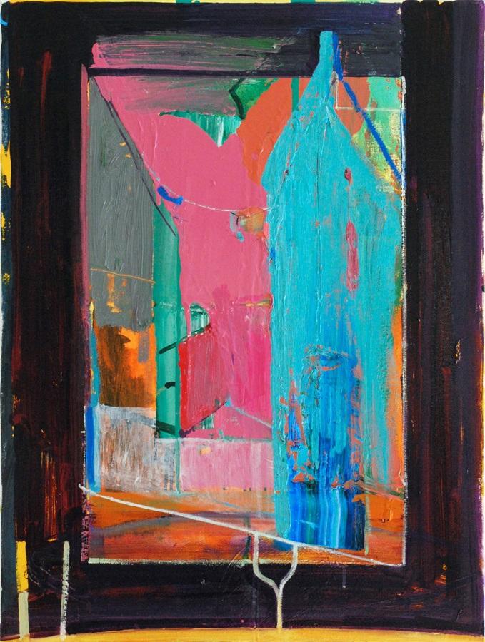
Amongst all the loveliness, it is necessary to remind the viewer the painting is sourced in a crime-novel and the word/clue 'Toxic' in the title jolts the viewer back to this reality.
THURS 8 AUG p.m
That's better - the painting has come alive, Pink Floyd's 'Animals' blasting away. Fast brush-marks on the left, colour-incident, elegant line cutting and twisting the space and bringing the 'frame' into the painting. Rhythms of curves- this painting is on the move! Love working edges...

in situ
 detail-pulsating colour...
 colours and tools...
 Thursday a.m
THURS 8 AUG a.m
Working on the colour - there is a specific red-ochre/blue combination that I'm after and I think I've found it in the bottom-right corner. The novel opens with a corpse seen through a window and I've been exploring the idea of the window or painted-frame which creates a tension between inside and outside, with the central 'image' barely contained. Enjoying the relationship between the three spikes. Perhaps the colour combination is too balanced and the left-side too empty? Is the painting too flat?
 beginnings...
WED 7 AUG 2019
Choices: two books from a favourite series...one involved a storm but I feel I want to move away from darkness. This painting will be about colour: ochre and turquoise is the palette, which may be significant in the novel...
Choices: which twin-canvas to use? (below). Three very different possibilities, all seem small after 'Out-With' - went for the pink and green...

'20 Books = 20 Paintings' - the series so far...
